Principles of Microeconomics · Lecture 3
In this lesson
Elasticity and the Applications of Demand
The previous post established the machinery this one puts to work. The first law of demand says that at a higher price people buy a smaller quantity of a good, and at a lower price a larger one, holding everything else the same. Plotted with price up the vertical axis and quantity along the horizontal, that fixed demand schedule slopes downward to the right. Why does it slope down? Because of marginal personal worth: the most you would pay for one more unit falls the more you already have, so each additional unit is worth less than the one before, and the curve that plots worth against quantity tilts downward. That diminishing worth is the engine under the whole law.
None of this assumes buyers carry a numerical schedule in their heads or do arithmetic at the register; the law describes how people behave when their options change, not what they consciously think. What the first law does not tell us is how much quantity moves when price changes, what that does to a seller’s revenue, why time changes the answer, or why the same dollar charge can send the better grade of a good to the far side of the country. Those are this post’s questions.
Figure focus. Required: elasticity along a line; supply shift versus demand shift. Others are references unless assigned.
Elasticity Measures How Sharply Quantity Responds to Price
The first law tells us which way quantity moves when price changes, not by how much. For that we need elasticity.
If a 1 percent rise in price brings a 3 percent drop in quantity, elasticity is 3. When that ratio is greater than one, demand is elastic, meaning quantity is highly responsive; when it is less than one, demand is inelastic, meaning quantity barely budges.
Two wording traps are worth disarming now. First, elasticity is a ratio of percentages, not an absolute amount: “the percentage change in quantity for a one-cent change in price” is wrong twice over, since it should be a one-percent change in price, and a ratio of two percentages, never a per-penny figure. Second, elasticity measures movement along a curve, so “a 3 percent decrease in demand” is sloppy; it should be a 3 percent decrease in quantity demanded, not a shift of the whole curve.
One practical question remains before you can calculate anything: a percentage change measured from which base? A price cut from $10 to $9 is a 10 percent fall, but the same step run backward, from $9 up to $10, is an 11.1 percent rise. To keep the answer from depending on the direction of travel, measure each change against the midpoint, the average of the two endpoints. That convention is the midpoint formula, and it is the version to use in this course whenever you calculate an elasticity between two points on a demand curve.
elasticity e = |percentage change in quantity demandedpercentage change in price|
%ΔQ = Q2 − Q1(Q1 + Q2) ÷ 2 × 100 %ΔP = P2 − P1(P1 + P2) ÷ 2 × 100
Here (Q₁, P₁) and (Q₂, P₂) are the two points you are comparing. Because price and quantity demanded move in opposite directions along a demand curve, the raw ratio is negative; the absolute-value bars turn it into the nonnegative magnitude we report. Try it on one step: price falls from $6 to $5 while quantity rises from 5 to 6. The quantity change, measured against the midpoint quantity of 5.5, is 18.2 percent; the price change, measured against the midpoint price of $5.50, is −18.2 percent. So e = |18.2/−18.2| = 1: unit elastic, exactly.
Here is a demand schedule with the elasticity between successive points computed by the midpoint formula, plus the market value (price times quantity) at each.
| Price | Quantity | Market value | Going down one row: % price cut (midpoint) | % quantity rise (midpoint) | Elasticity |
|---|---|---|---|---|---|
| $10 | 1 | $10 | — | — | — |
| $9 | 2 | $18 | 10.5% | 66.7% | 6.3 |
| $8 | 3 | $24 | 11.8% | 40% | 3.4 |
| $7 | 4 | $28 | 13.3% | 28.6% | 2.1 |
| $6 | 5 | $30 | 15.4% | 22.2% | 1.4 |
| $5 | 6 | $30 | 18.2% | 18.2% | 1.0 |
| $4 | 7 | $28 | 22.2% | 15.4% | 0.69 |
| $3 | 8 | $24 | 28.6% | 13.3% | 0.47 |
| $2 | 9 | $18 | 40% | 11.8% | 0.29 |
| $1 | 10 | $10 | 66.7% | 10.5% | 0.16 |
Two features jump out. First, elasticity changes as you move along a straight-line curve: large at high prices near the top, small at low prices near the bottom, passing through one right at the step where the market-value column flattens at its peak. So for this straight-line schedule, you cannot speak of “the” elasticity as a single number; you have to say at what price. Specially shaped constant-elasticity curves do exist, but constancy is not a property of demand curves in general.
Why does the same straight line give different elasticities? Because a percentage depends on its base. The figure below lets you watch the bases do the work. The two dots mark a one-unit step on the line: between them, price falls by $1 and quantity rises by 1. The readout underneath runs the midpoint formula on that step, just as we did above. Near the top of the line, a $1 cut is a small percentage of a high price, while one more unit is a large percentage of a small quantity, so the ratio is large. Near the bottom, the same $1 and the same one unit are set against a low price and a large quantity, so the ratio is small. The step itself never changes; only the bases the percentages are measured against do.
Second, and this is the most common student error, elasticity is not the slope: two curves can share the very same slope yet differ in elasticity, and two curves with different slopes can share an elasticity at some price, so a flat-looking curve is not automatically the more elastic one. (“Inelastic” does not mean quantity fails to respond at all; that extreme is zero elasticity. It just means the response is less than proportional.) In the figure below, the two demand curves are exactly parallel, yet the readout, running the same midpoint arithmetic on one shared price step, gives them different elasticities at every price; at the opening price, one is elastic while the other is inelastic. The percentages, not the steepness, decide.
Whether a Price Cut Helps a Seller Depends on Elasticity
Elasticity matters because it decides what happens to a seller’s total revenue when the price changes. You can read the rule straight off the market-value column above.
When demand is elastic (greater than one), quantity responds more than proportionally, so a price cut raises total revenue and a price rise lowers it. When demand is inelastic (less than one), quantity barely responds, so a price cut lowers total revenue and a price rise raises it. At unit elasticity (equal to one), revenue is unchanged either way; it sits at its peak, the flat $30 stretch around the middle of the table.
The whole thing fits in a small grid.
| Demand elastic (e > 1) | Unit elastic (e = 1) | Demand inelastic (e < 1) | |
|---|---|---|---|
| Price rises | Total revenue falls | Unchanged | Total revenue rises |
| Price falls | Total revenue rises | Unchanged | Total revenue falls |
So you cannot say in the abstract whether raising or lowering price will increase revenue; the answer depends on where the seller sits on the demand curve. Revenue is not profit, which also depends on costs, and neither measure by itself says buyers are better off.
One caution: elasticity measures movements along a demand schedule, not shifts in the schedule. Every price change we have discussed so far was a slide along one fixed curve. But prices also change because the whole schedule moves, and when that happens, the old curve’s elasticity cannot tell you what will happen to quantity or to the seller’s revenue.
Gasoline makes the difference concrete, with one supply idea previewed before we study supply formally. Suppose the quantity available for sale this week is fixed regardless of the week’s price. The vertical line in the figure records that fixed quantity. Where it crosses demand is the market-clearing price: the price at which buyers want exactly the amount available. Low stocks imply a high clearing price; moderate stocks, a middle price; plentiful stocks, a low price. Across these cases demand never moves. A change in the available stock moves the vertical supply line and selects a new point on the same demand curve, precisely the movement elasticity describes.
Now run the other experiment. Hold the week’s stocks fixed and let demand itself rise, say a holiday weekend that puts more drivers on the road. The whole demand curve shifts to a higher one, and the price rises with no change in quantity at all: the market moves from where the old curve crossed the fixed supply to where the new curve crosses it. Nobody slid along a demand curve, so no elasticity of demand describes this price change.
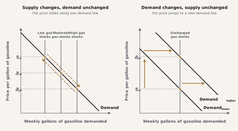
So always ask first whether you are sliding along a curve or watching one move. A price change from a supply shift traces out the demand curve; a price change from a demand shift replaces it.
Demand Becomes More Elastic the Longer People Have to Adjust
There is a second law of demand, and it concerns time: demand is more elastic the longer the interval since a price change. This is a comparative-horizon tendency: when a longer horizon expands feasible substitutions and other conditions are comparable, more adjustment can occur. It is not a promise that every long-run estimate exceeds every short-run one while technology, income, expectations, policy, and the composition of buyers are also changing.
Gasoline is the standard case. Double the price overnight and consumption falls only a little at first; people still have the same cars and the same commutes. But over a year or three, they buy more efficient cars, move closer to work, carpool, and carmakers redesign their fleets. So consumption falls more after three years than after one. A common objection runs, “a 10 percent gas price rise won’t change how much I drive tomorrow, so the law of demand is bogus.” It is not. The law never promised an instant or universal response. Some people respond right away, more respond over time, and the market as a whole responds because some people do, even if you personally do not.
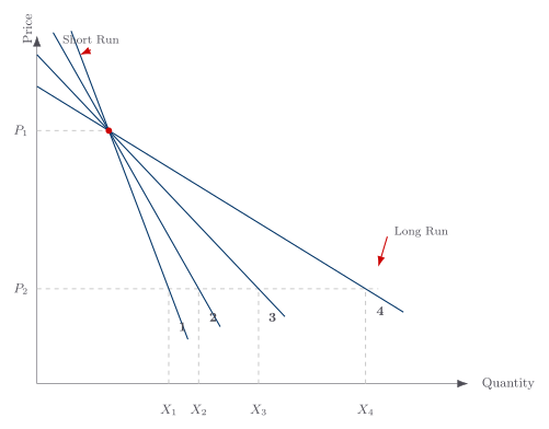
The neat way to picture the buildup: any single demand curve is one member of a fan of curves radiating from the original price-quantity point. The short-run curve through that point is steep, because little adjustment has happened yet; the long-run curve through the same point is flatter, because more adjustment has accumulated. Normally, flatness alone does not identify elasticity. This comparison is informative because it is tightly controlled: every curve passes through the same starting point and is tested with the same price change. The curve that produces the larger percentage change in quantity is more elastic; in this particular fan, that curve is also flatter.
To read the figure below, start at the point where every curve meets: gasoline sells at the price P₁, and drivers buy the quantity Q. Then the price falls to P₂. In the first weeks the steep curve 1 is the one that applies, so quantity moves only from Q out to Q₁. As the months pass, the operative curve flattens through 2, 3, and 4, and the quantity bought at that same price P₂ climbs to Q₂, then Q₃, then Q₄. Once every adjustment has run its course, the flattest curve L takes over, and purchases settle at Qₗ, far to the right of where they began. The price fell once, but the response to it keeps building for years. That is what it means for demand to grow more elastic with time.
Two Short Previews Connect These Tools to Later Topics
The post’s three main objectives remain elasticity, adjustment over time, and relative price. The next two ideas are short previews: they preserve connections we will develop later, but they are not additional main objectives for this session.
A Seller Faces a Demand of Its Own
There is the individual’s demand, one buyer’s schedule, like the price-quantity schedule we started with. Market demand adds all buyers’ quantities at each price. A third schedule, the demand facing one seller, shows how much that seller can sell at each price it might charge.
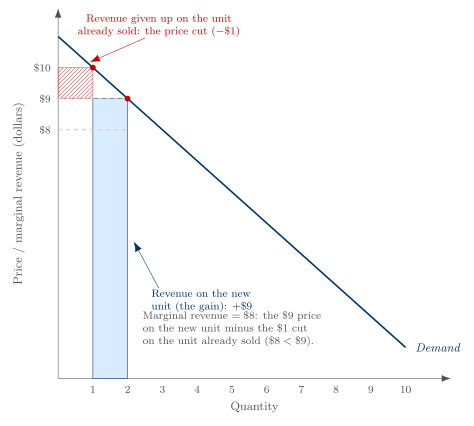
The third schedule previews our later study of firms with power over price. To sell one more unit, such a seller usually must cut the price on every unit, including those it was already selling. So the extra revenue from that unit, its marginal revenue, is less than the price received. The figure records the gain on the new unit and the loss on the earlier ones; for now, keep only that accounting idea.
Income and Ownership Can Shift Demand
A change in a good’s own price moves buyers along a demand curve; a change in income can shift the curve. Modern principles courses call a good normal when higher income raises its demand and inferior when higher income lowers its demand. Among normal goods, a positive income elasticity above one is often called a luxury, while one between zero and one is a necessity. Alchian and Allen use different labels: their “superior” means more-than-proportional growth and their “inferior” means less-than-proportional growth, even when demand still rises. We will use the modern terminology to avoid confusing a necessity with an inferior good. Unlike own-price elasticity, income elasticity retains its sign because that sign tells us which category the good occupies; this is a preview, not a calculation target for this session.
Income is one force that moves the whole curve. A price change can do so too when the buyer owns a large stock of the good whose price changes.
When a good’s price changes, two forces can act on a net owner who can sell the asset or output. We can separate them in words without adding a new consumer-choice apparatus.
The first is the substitution effect. When a good gets more expensive relative to others, you lean away from it toward the now-relatively-cheaper alternatives. This force always pushes the same way: a higher own-price means less of the good. The second is the wealth effect, and its direction depends on your situation. A higher price for something you buy makes you a bit poorer in real terms, since your money buys less, which usually nudges you toward a little less of most goods. But here is the twist: if you own a lot of the good whose price rose, the higher price makes you richer, and that can push you toward consuming more.
Suppose you own a dairy farm and the price of milk rises. Substitution pushes you toward drinking less because milk is now dearer relative to other drinks. If you are a net seller with secure sale rights, the higher price raises the value of your output and can push toward more consumption. Which force wins is ambiguous. For a shopper without a large stock, that ownership channel is absent; an ordinary wealth effect can still matter, but substitution usually preserves the downward relationship.
In the figure, the higher milk price moves the farmer along a curve while the added wealth shifts her curve right. Use the buttons to compare a large shift, where the wealth effect wins and Q₂ exceeds Q₁, with a small shift, where substitution wins and Q₂ falls below Q₁. Every curve still slopes down; the unusual result comes from a shift, not from an upward-sloping demand curve.
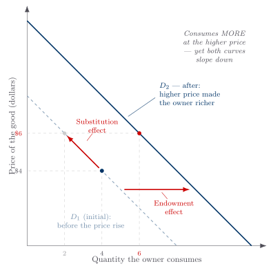
For someone holding a large stock of the good whose price changes, the wealth effect is the nearest thing to a genuine exception to the law of demand, and even it is a shift of the curve, not an upward-sloping one. With those previews parked for later, return now to the post’s main thread.
The Real Price Is the Relative Price
A good’s dollar tag does not by itself govern your choice. What matters is its relative price: how much of other goods you give up to get it. As the previous post showed, one dollar price can rise while a good becomes cheaper relative to another. Suppose candy rises from $4 to $5 while ice cream rises from $2 to $3. Candy costs more dollars, but less ice cream than before because ice cream’s price rose by a larger percentage. Always ask, “relative to what?”
The relative-price idea does real work in a memorably named application: the “shipping the good apples out” theorem, due to Alchian and Allen.
Adding the Same Charge to Two Goods Sends the Better One Away
Here is the puzzle. Why do the regions that grow the best produce so often ship their finest grade away and keep the ordinary stuff, so that you find better Maine lobster in Chicago than in Maine? The answer is pure relative price. Suppose California grows choice grapes that sell there for $1.00 a pound and standard grapes for $0.50 a pound. Now ship both to New York at the same transport cost of $0.50 a pound, regardless of quality.
| California price | + transport | = New York price | |
|---|---|---|---|
| Choice grapes | $1.00 | $0.50 | $1.50 |
| Standard grapes | $0.50 | $0.50 | $1.00 |
Look at the relative prices. In California, a pound of choice costs two pounds of standard ($1.00 versus $0.50). In New York, a pound of choice costs only 1.5 pounds of standard ($1.50 versus $1.00). Adding the same dollar charge to both grades has made the choice grapes relatively cheaper in New York. Holding preferences, incomes, available grades, and other costs fixed, the first law predicts a larger choice-grade share in New York. The mechanism does not require a taste difference, though an observed quality mix alone cannot rule one out.
The arithmetic is general: adding the same positive amount to a high and a low price shrinks their ratio. High and low meat at $10 and $5 stand in a 2-to-1 ratio; add $10 to each, making $20 and $15, and the ratio falls to 1.33-to-1. A common babysitter charge similarly lowers the price of dear theater relative to a cheap movie. When the charge is truly equal per relevant unit and other determinants are held apart, that relative-price change tends to tilt the chosen mix toward the higher-priced grade.
With the demand tools now in hand, we turn next to exchange: why buyers and sellers can both gain from trading the same good.
For Further Reading
Want to explore the source material? This lecture draws on the following chapters from two books by Armen A. Alchian and William R. Allen:
- Universal Economics (Liberty Fund, 2018): Ch. 8, “More Features of Demand”; Ch. 9, “Some Implications of the Laws of Demand”.
- Exchange and Production, 3rd ed. (Wadsworth, 1983): Ch. 2, “Consumer Demand”.
Key takeaways
- Elasticity decides how a price change affects revenue. It is the absolute value of the percentage change in quantity demanded divided by the percentage change in price, calculated between two points with the midpoint formula; it varies along a straight-line curve rather than equaling the slope. Where demand is elastic a price cut raises total revenue, while where it is inelastic a price cut lowers it, with revenue peaking at unit elasticity.
- Demand typically grows more elastic when a longer horizon expands adjustment. The second law's fan shows a larger response as people find substitutes and replace equipment, holding the underlying comparison fixed; changing technology, income, expectations, policy, or buyer composition can complicate an observed short-run/long-run comparison.
- The real price is the relative price. What you give up in other goods, not the dollar figure, governs your choice, so a good's dollar price can rise while its relative price falls, and adding the same fixed charge to two grades of a good shrinks the ratio between them, making the finer grade relatively cheaper wherever it lands.
Lecture recaps
A summary of what we covered in each class session on this topic.